"Man invented language to satisfy his deep need to complain."

nonchalant antipathy
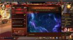
Regarding the user interface, I've had a few thoughts about modifications that should be made to make the experience a less torturous exercise in futility.
The thrice-darned offering pedestals that usually get blocked from being clicked on because other players are on top of it? Jaysus Christ on a jumped-up chariot-driven crutch! This design should have never gotten through the initial testing stage. It is not clever, nor an acceptable manner in which to increase difficulty, having horrible and frustrating object selection, unless that is the point of the game. That is not the point of this game. You want to offer, you should be able to offer without messing with the screen rotation or waiting for players to move out of the way. Easiest way to fix it would probably be to put where you click to offer over the little abysses in the center, where players would still run to the actual pedestal but wouldn't cover it up.
Related to selection is how the huge mounts make it hard to click on anything else near them. Decrease their clickable radius. Simple. BOOM.
Make the map click-through, as well as the floating text telling you when monsters and chests respawn. There's no reason for this not to be. In a competition that relies, somewhat, on reflex, being hampered in where you click to move is irritating.
Make BRs easier to read. Too many a time I've attacked something I thought was close to my own rating, only to realize, far too late, that I misread the crammed together numerics. Either needs a better quality font or a color that doesn't blend in so much.
I'm sure there's other ways to revamp it, but those faults are the most glaring and all I got right now.
"In the beginning, the Universe was created. This has made a lot of people very angry and been widely regarded as a bad move."
Translate

nonchalant antipathy
"Man invented language to satisfy his deep need to complain."
Popular Posts
1

bugged
26 discussions 85 views
2
Angel Cards event
21 discussions 86 views
3
Thanks Dev
29 discussions 395 views