
It's all snakes, rats and mules.

jayfantz
There should be a way to switch the navigation method on the kingdom view. The game constantly registers clicks after you have already released, and clicking icons can register with a delay, causing it to open something else entirely.
Also, why can't you just add a weapon icon to the commander in battle, like the advisor, so it can be changed directly?
Or even a hover icon. Dragon already has icons. Everything else is listed, and even the Army Grounds preference setting has ability to change with clean interface. But there is no way to know in certain scenarios what is equipped and what isn't unless you physically initiate a battle that generates a report.
Tournament is especially confusing because you have 2 lineups, attack and defense, and even these can clash. Then there is the refresh function, where you don't know if the change actually registered unless you go into the lineup, but its unclear because there is no way to know what actually changes. You don't know legends, skins, nothing. Even then, the lineup doesn't really show anything significant, nor does refresh increase the army size if you have gained a new army size.
This is extremely frustrating, particularly when you are guarding the wagon, because simply opening the trade page seems to change the setup, regardless if you click lineup, it might even simply change without even opening, it's unclear and delayed. If you can change the advisor in pre match, you should be able to change the weapons. Or make weapons work like dragons, where you can see the relevant information when you hover. If not, make weapon presets for quick settings so you can ensure you have what you need.
If you are doing Tournament, Camps, rallies, Bounty Battles and Mines, you have so many different things happening. For someone who doesn't use 1 standard lineup for every commander, except maybe for the main lineup, which isn't always capable of handling every situation, this becomes extremely frustrating, not mention using different troop styles which require top to bottom edits.
It's also crazy that you have to go into the commander section, click commanders off, then put them back in just to see what percentage the lineup is. Why isn't this standardized and always visible? Or maybe a view stats button or something.
Lastly, there is a bad bug that switches the lineup formation for some reason after you change it in prematch. These things might seem trivial, but when everything has a limit and specific requirements for the desired outcome, you can't waste time. The presets should simply be applied in prematch and remain consistent.
There is also so much wasted space in the game's UI that you have to scroll through things you shouldn't have to. The weapons list and Dragon skills list are great examples of how compact the interface can be. But the Friendship menu, Commander menu and Legendary Weapons menu are unnecessarily large, with huge amounts of empty space that serve no purpose.
Why isn't there a way to equip a weapon directly from the weapon menu? Or unequip one when trying to sell? Everything feels disconnected. The advisor choice is clean, but you have to go through the commander list 1 by 1 to manage it in the efficient menu style. It makes no sense. Unless the design is supposed to be frustruating and time intensive this game makes no sense in its design mapping. Even changing the resolution does nothing.
Cleaning up the game, or having a lite version built around this kind of management system,only for edits and quick matches, would probably help with the lag as well. Another option would be a companion app where you could manage commanders, weapons, advisors, formations and presets without having to navigate through the main game.
The last month on the downloaded version has been a disaster. It crashes all day.
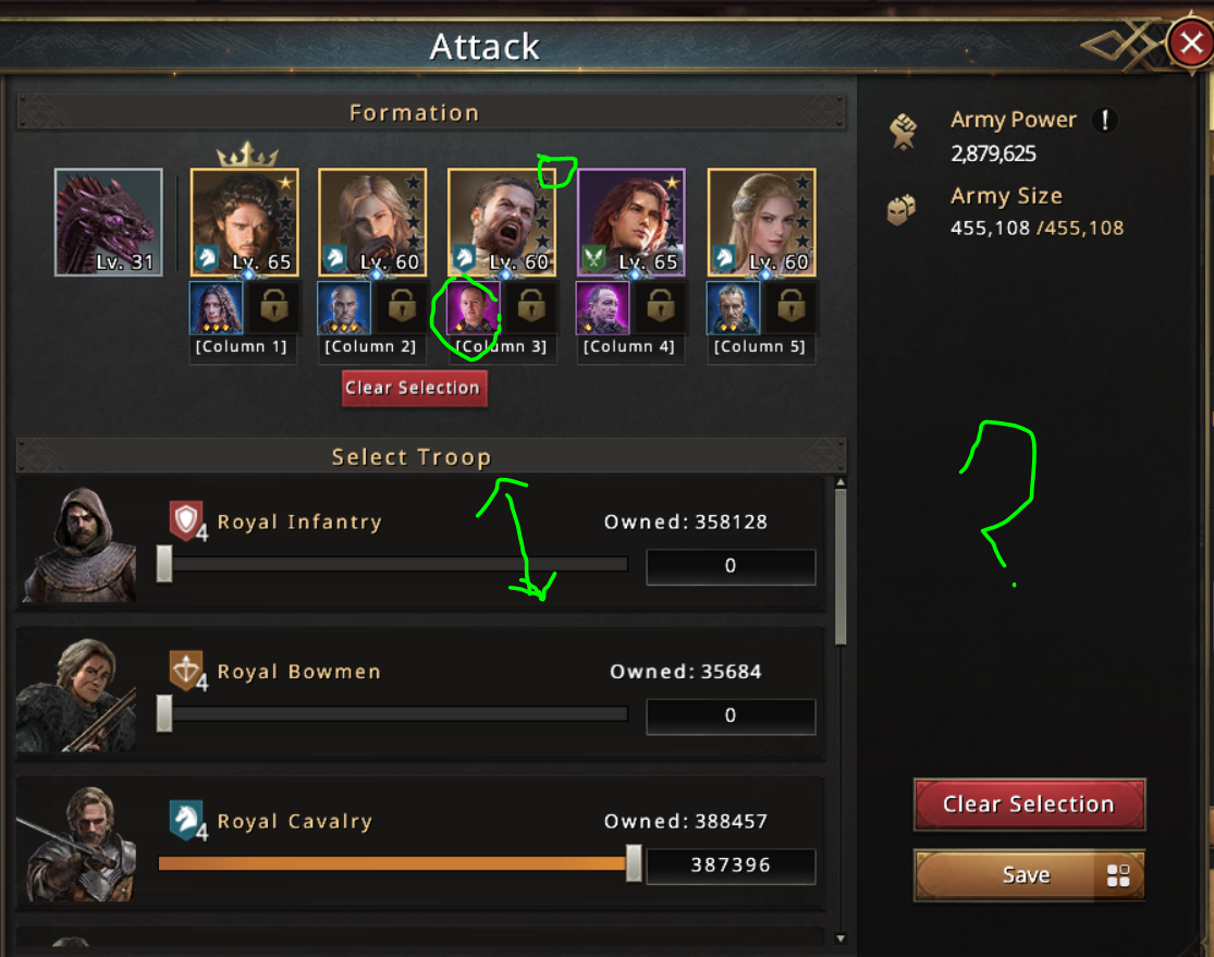
Just so much wasted space. If there are 4 troop styles, wouldn't you think to fit 4 troops in the page? Like the skin is so irrelevant any made it the reason the container is so big. And further look at the right when you open it. The power is irrelevant if you don't know bonus amounts. Why be complicit with that space. The word column below the commander is also pointless you could easily put weapon there or above like u have it for dragons. Even if you make the bonus information when you hover over the power information something. And when you go to choose commanders or weapons here its just so much wasted space. I don't know why your design is content with scrolling and dragging and hidden icons to discover but its extremely unnecessary. Why take 100ft for something you can do in 10ft? If i presented this to someone as an app or website I would be heavily criticized. Things overlapping and hidden is never a good look. And empty spaces are a waste.
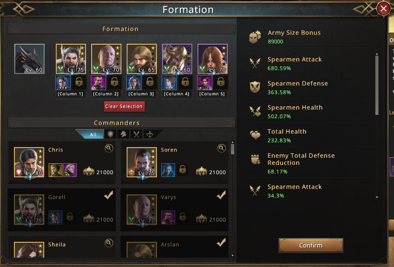
The menus right bar container isnt even the same size lol. And you could move the troop number, harmonize the bar size an put three commanders there lol. Like look are your spacing, the words end and in before the nav bar on the right.
Anyways, the games fun but you guys make it extremely conducive to totally avoidable, and, unforeseeable clerical errors.
Lastly, why do you have a clear all button for the dragon skills but not the equipment badges. Insane.
Translate

Popular Posts
1

No reponse or action made by support team for 3 weeks on my ticket
8 discussions 19 views
2
bug amelioration recherches
69 discussions 137 views
3
Persistent red dot indicator on Benefits -> Discount Pack
43 discussions 157 views